In this project, conducted while studying at the School of Code bootcamp over the course of 2 days, I explored a topic increasingly relevant in the digital age. While Lasting Powers of Attorney typically cover Finance and Property, as well as Health and Welfare, our focus was on the overlooked area of digital assets.
I examined important questions such as: what happens to social media accounts and personal data if someone loses mental capacity? Should someone manage their digital presence, and how should access to platforms like WhatsApp or Facebook be handled?
Eager to expand my skills, I explored Figma outside of bootcamp hours, as this was my first time using the software. I quickly picked it up and was able to contribute effectively to the design process.
Our final prototype was an app designed to link social media and banking accounts with trusted legacy contacts, ensuring responsible management of digital assets in case of mental incapacity.

Color Theory and Branding:
In designing this app, meticulous attention was paid to color theory to enhance user trust and readability. The app features a mid-tone blue, chosen for its associations with trust, reliability, and professionalism. This shade of blue was selected for its contrast with white, ensuring high readability while maintaining a bright, engaging aesthetic. The simple lock logo was chosen for its simplicity and recognisability.
Homepage Design:
On the homepage there’s a prominent area at the top with a compelling headline, a brief tagline or description, and a call-to-action button. This was designed to quickly convey the app’s main proposition and encourage users to sign up or learn more. The homepage includes curated articles of interest and a live chat feature to assist users with any queries or difficulties, enhancing the overall user experience and engagement.
Menu and Navigation:
The app’s menu is designed to be clean and user-friendly, consistent with the simple design of the app. This simplicity in navigation aids users in easily finding their way around the app.
User Verification:
For enhanced security and verification, the Sign-Up page requires an NHS number to confirm mental capacity, alongside a passport number for additional user verification. This two-tiered approach ensures that user data is managed responsibly and securely, aligning with the app’s commitment to safeguarding digital assets.
My Account Page:
On the 'My Account' page, users are greeted with their profile at the top, accompanied by a progress bar that reflects the completeness of their account. This bar visually indicates how much of the account setup is complete, with updates based on whether a legacy contact has been selected and whether that contact has accepted responsibility. This feature was introduced with User-Centered Design (UCD) principles in mind, enhancing user engagement by providing clear, actionable feedback on their account status.
Legacy Contact Management:
Lastly, as reflected in our research, users would prefer to have someone different manage their social and banking accounts. I’ve added a feature where you can select from more than one legacy contact and I have separated the management pages as seen on both the ‘My Account’ and ‘ Data Management’ pages.
How did I come to this conclusion?...
 Survey Results:
Conducting research for this project was invaluable. Our initial predictions didn’t align with some of the outcomes, making the research essential for accurate insights so I could make informed design decisions.

Throughout this project, I worked to understand the problem, conducted user research, and developed potential solutions. I created wireframes and prototypes to present our findings and solutions during the Hackathon presentation. This project strengthened our skills in user research and solution development, encouraging us to think critically and creatively about a modern issue.
Disney Ideation:
By applying methods like Disney Ideation, I pinpointed key challenges and developed creative solutions.
![]()
Low fidelity wireframes:
Here I outlined the basic layout of a design without focusing on detailed aesthetics. It helped us quickly convey the app's functionality and user flow, and core elements, allowing for early feedback and iterative improvements before investing in high-fidelity designs.
![]() Reflection:
Reflection:
Reflecting on this project, the tight timeline constrained our ability to conduct more in-depth research, such as user interviews, which would have provided a deeper understanding of our users. Ideally, I would have developed additional wireframes and incorporated more accessibility features, like language settings, to enhance the app's usability for a broader audience.
Despite these limitations, our effective planning and focus on essential features allowed us to deliver a functional and user-centered product within the time constraints.
Disney Ideation:
By applying methods like Disney Ideation, I pinpointed key challenges and developed creative solutions.

Low fidelity wireframes:
Here I outlined the basic layout of a design without focusing on detailed aesthetics. It helped us quickly convey the app's functionality and user flow, and core elements, allowing for early feedback and iterative improvements before investing in high-fidelity designs.
 Reflection:
Reflecting on this project, the tight timeline constrained our ability to conduct more in-depth research, such as user interviews, which would have provided a deeper understanding of our users. Ideally, I would have developed additional wireframes and incorporated more accessibility features, like language settings, to enhance the app's usability for a broader audience.
Despite these limitations, our effective planning and focus on essential features allowed us to deliver a functional and user-centered product within the time constraints.
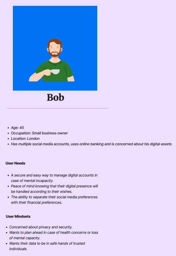
User Story:
From our research, I painted a picture of a typical user and created a user story to capture their specific needs and goals. This helped us to clearly understand what our users wanted to achieve and why, guiding our design and development process to ensure the final product met their needs effectively.
![]()
From our research, I painted a picture of a typical user and created a user story to capture their specific needs and goals. This helped us to clearly understand what our users wanted to achieve and why, guiding our design and development process to ensure the final product met their needs effectively.

© Lana Maugé 2024